Create a character that feels like it belongs in a Disney game, and the rest of the process gets a lot simpler.
Most readers start with the same questions: What makes a character memorable? How do you make a Disney-inspired design feel original instead of copied? What should the face, costume, and colors say before the character even speaks? Walt Disney’s well-known line still holds up here: “If you can dream it, you can do it.” The useful part is turning the dream into something a game can actually use.
Character design is not just drawing a cute figure and moving on. It is a mix of shape language, personality, silhouette, and gameplay clarity. Character design gives you the basic vocabulary, while Pixar in a Box shows how shape, expression, and gesture communicate character fast. That matters because a game character has to read cleanly on a screen, often in motion, often at a glance.
This guide walks through the full process: defining the character, sketching the first version, refining the visual style, choosing tools, and sharing the finished design with other fans. If you want more game-focused reading after this, start with the blog index, keep the contact page handy for questions, and use the home page when you want a quick way back to the main site.
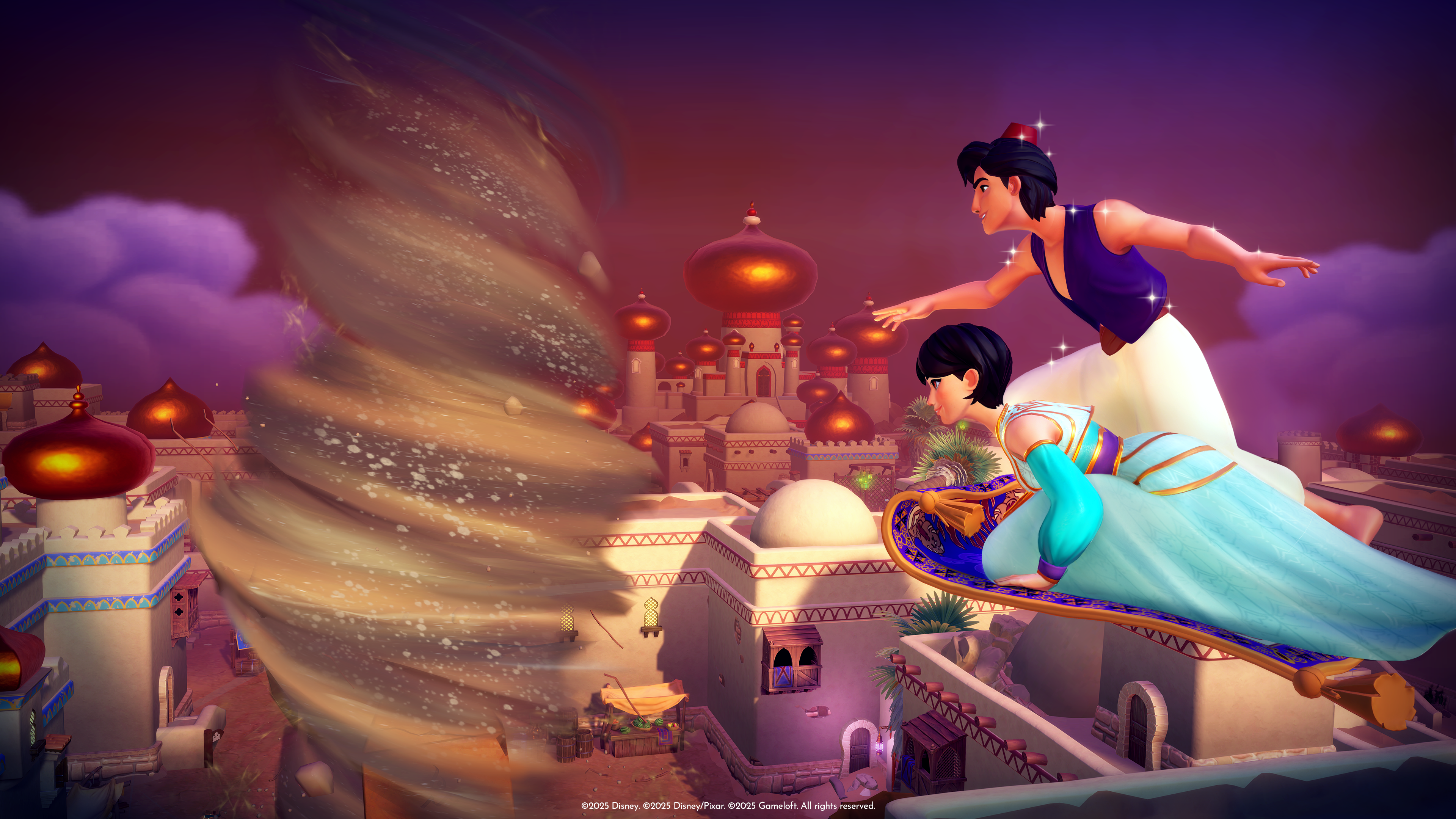
What Makes a Disney-Inspired Game Character Work
A good Disney-inspired game character is easy to identify, easy to remember, and easy to imagine in action. That usually means a clear silhouette, a small number of strong visual ideas, and a personality that shows up in the pose and costume. If the design needs three paragraphs of explanation, the design is doing too much of the writer’s job.
Disney characters often work because they have a few strong anchors: one dominant shape, one obvious emotional idea, and one visual detail that sticks. A hero might feel rounded and optimistic. A trickster might use sharp angles and a more chaotic pose. A mentor might carry balance, symmetry, or older styling. None of that is accidental, and none of it should be left to chance.
Core Terms You Should Know
| Term | Meaning | Why it matters |
|---|---|---|
| Silhouette | The outer shape of the character when filled in as a solid form. | If the silhouette is distinctive, the character is readable even at small size. |
| Shape language | The use of circles, squares, triangles, and combinations to suggest personality. | Shape does a lot of storytelling before color ever shows up. |
| Turnaround | A set of views showing the character from front, side, and back. | This keeps the design consistent if you redraw it later. |
| Color script | A rough plan for the character’s main colors and how they balance. | Color can make a design look heroic, playful, mysterious, or unstable. |
| Polish pass | The final refinement stage after the rough design is working. | This is where you clean the weak spots instead of adding more noise. |
Step 1: Define the Character’s Role
Start with function, not costume. Ask what job the character has in the world of the game. Are they the brave lead, the mischief-maker, the mentor, the inventor, the comic relief, or the quiet explorer? The role determines posture, clothing, and even how much detail the viewer should expect.
Write a one-sentence brief before you draw anything. For example:
- Explorer: a curious map-maker who is always one clue ahead of the others.
- Guardian: a calm protector with heavy shapes and grounded movement.
- Spark: a fast-talking sidekick with bright colors and exaggerated gestures.
- Rival: a polished, competitive character who looks too composed to trust at first glance.
That short brief keeps the design honest. A character that tries to be everything usually ends up looking like a department store mannequin after a long meeting.
Step 2: Build the Backstory in Plain Language
Backstory does not need a novel. It needs a reason. What did this character want before the story started? What do they fear? What do they protect? What do they hide? One or two useful facts are enough to guide the look of the face, clothing, and props.
Use this quick formula:
- Goal: what the character wants now.
- Problem: what keeps them from getting it.
- Trait: one personality feature that should show in the design.
- Signature item: a belt, bag, wand, glove, badge, scarf, or other detail that tells the story.
Example: a character who studies moonlight may have a softer palette, reflective details, and a calm expression. A character who sneaks through candy-colored levels may have sharper posture, quick shoes, and a face that looks ready to bolt.
Step 3: Choose a Disney-Friendly Design Style
The phrase “Disney-inspired” is broad. That is a feature, not a problem. You can lean toward classic animation, modern adventure, fairy-tale charm, or stylized game art. What matters is consistency. Do not mix five visual languages and hope the audience sees genius. They usually see confusion.
Pick one style direction first:
- Classic storybook: rounded forms, elegant posture, soft edges, and a timeless feel.
- Adventure game: practical clothing, clear movement, and stronger contrast.
- Magical realism: familiar shapes with a few surreal details or glowing accents.
- Cartoon hero: exaggerated proportions, bold expressions, and simple readable lines.
If you want a wider view of how stylized character work is translated into software and 3D pipelines, the free Blender tutorials are useful reference material. If you prefer digital painting, Krita’s feature set is a practical place to start.
Step 4: Sketch Three Versions Before You Commit
Do not lock in the first drawing. That is how weak ideas get promoted. Sketch at least three versions with noticeably different silhouettes. One can be tall and elegant, one small and energetic, and one broader or more grounded. The point is to compare, not to decorate.
When you sketch, focus on these priorities:
- Silhouette first: if you black out the shape, does it still look interesting?
- Face second: does the expression match the role?
- Costume third: does the clothing support the story, or is it just adding noise?
- Accessories last: only keep the items that do real narrative work.
Try this practical drill: draw the same character in three different poses, then shrink each sketch to thumbnail size. If the best version still reads clearly, you have something worth refining. If not, the design needs stronger decisions.
Step 5: Choose a Color Palette With Discipline
Color is not decoration. Color is one of the fastest ways to signal personality and status. Disney-style designs often use a limited palette with one dominant color and one or two accents. That restraint helps the character stand out without turning into a paint sample wall.
Use a simple palette rule:
- Main color: the tone that defines the character at a glance.
- Secondary color: a supporting tone that balances the main one.
- Accent color: a small pop used for eyes, props, trim, or magic effects.
For example, a warm gold-and-blue palette can feel heroic. A mint, coral, and cream combination can feel playful. Deep violet with silver accents can feel mysterious without becoming melodramatic, which is hard to do in game art and in monthly budgeting.
Step 6: Add Details That Earn Their Place
Every detail should do at least one of three things: support the story, help the silhouette, or improve readability. If a detail does none of those things, it is probably filler.
Good details include:
- a distinctive badge or charm that points to the character’s role
- a hairstyle or head shape that is easy to spot in motion
- a prop that shows the character’s skill or occupation
- a pattern, stitch, or trim line that ties the costume together
Be careful not to overbuild the design. Too many pockets, straps, trims, and magic symbols can make the character look like they got dressed in the dark while being late for a quest.
Step 7: Test the Character in Game-Like Situations
A character is not finished when it looks good on a white page. It is finished when it works in a game environment. Drop the character into simple scenes: a village square, a dark cave, a bright shop, a battle stance, or a dialogue screen. Then ask what disappears, what pops, and what feels out of place.
Use these checks:
- Readability check: can you identify the character in three seconds?
- Motion check: do the limbs and clothing still make sense in action?
- Scale check: does the design survive being small on mobile or in a HUD?
- Theme check: does the character still feel like part of a Disney-inspired world?
This is also the point where a 3D preview can help. If you model the character in Blender or build a rough digital mockup, the form problems show up quickly. That is useful. Painful, but useful.
Tools and Resources for Design
You do not need a professional studio to start. You need a clear process and the right tools for the stage you are in. Sketch first, refine second, and save the fancy effects for later.
| Tool Type | Examples | Best Use |
|---|---|---|
| Traditional sketching | Pencil, eraser, fineliner, markers, sketchbook | Fast exploration, silhouette testing, and low-pressure drafts |
| Digital painting | Procreate, Krita, Photoshop, Adobe Fresco | Color studies, clean line art, and polished presentation sheets |
| 3D reference | Blender, simple posing tools, turntable apps | Turnarounds, volume checks, and rotation consistency |
| Planning aids | Reference boards, notes, prompt lists, mood sheets | Keeping the character’s look aligned with the story |
If you expect to use AI for brainstorming poses, costume ideas, or rough reference directions, a neutral resource on AI consulting services can help define the workflow before the concept pile turns into office folklore. Keep the process disciplined; even creative shortcuts need a fence.
For more on the craft behind digital illustration, the Procreate Handbook is a practical companion if you work on iPad, and Adobe Creative Cloud is still the default toolkit for many production workflows.
How to Share Your Character With the Community
Once the character is ready, share it. Fan communities are often the fastest way to get useful feedback, and they are also the best test of whether the design feels alive outside your own notes. Post the character on social platforms, in fan forums, or on a portfolio page, and ask specific questions instead of fishing for applause.
Good questions sound like this:
- Does the silhouette read clearly?
- Which detail feels strongest?
- Does the color palette support the personality?
- What feels too busy or too plain?
When you share, give context. Tell people the role, the tone, and the world the character belongs to. That helps feedback become useful instead of random. Random feedback is cheap. Useful feedback is work.
You can also collect design notes on the contact page if you want a simple place for visitors to reach out, or publish progress posts on the blog as you refine your character over time.
Final Checklist
- One clear role: the character does one job in the story.
- One readable silhouette: the design works even as a shadow.
- One consistent palette: the colors support the personality.
- One strong detail: the accessory or prop says something useful.
- One test in motion: the character still works in a game scene.
That is the real sequence. Decide, sketch, refine, test, and then share. Skip a step and the design usually tells on itself.
Conclusion
Creating your own Disney game character is less about drawing perfection and more about making clear decisions. Start with a role, shape the silhouette, keep the palette disciplined, and test the design where it will actually live: inside a game, not just in a folder full of good intentions.
If you want the shortest possible version of the process, it is this: define the character, sketch three variations, pick the strongest silhouette, limit the details, and ask real people what they read first. Then improve the parts they notice. That is how a character becomes memorable.
For more game ideas, browse the blog. If you want to send a question or share your character concept, use the contact page. If you just need to get back to the main site, the home page is there for a reason.